
Should the Ceiling Be the Same Color as the Walls?
Compare a matching ceiling and wall color with a traditional white ceiling, considering room height, lighting and the wood finishes in your home.
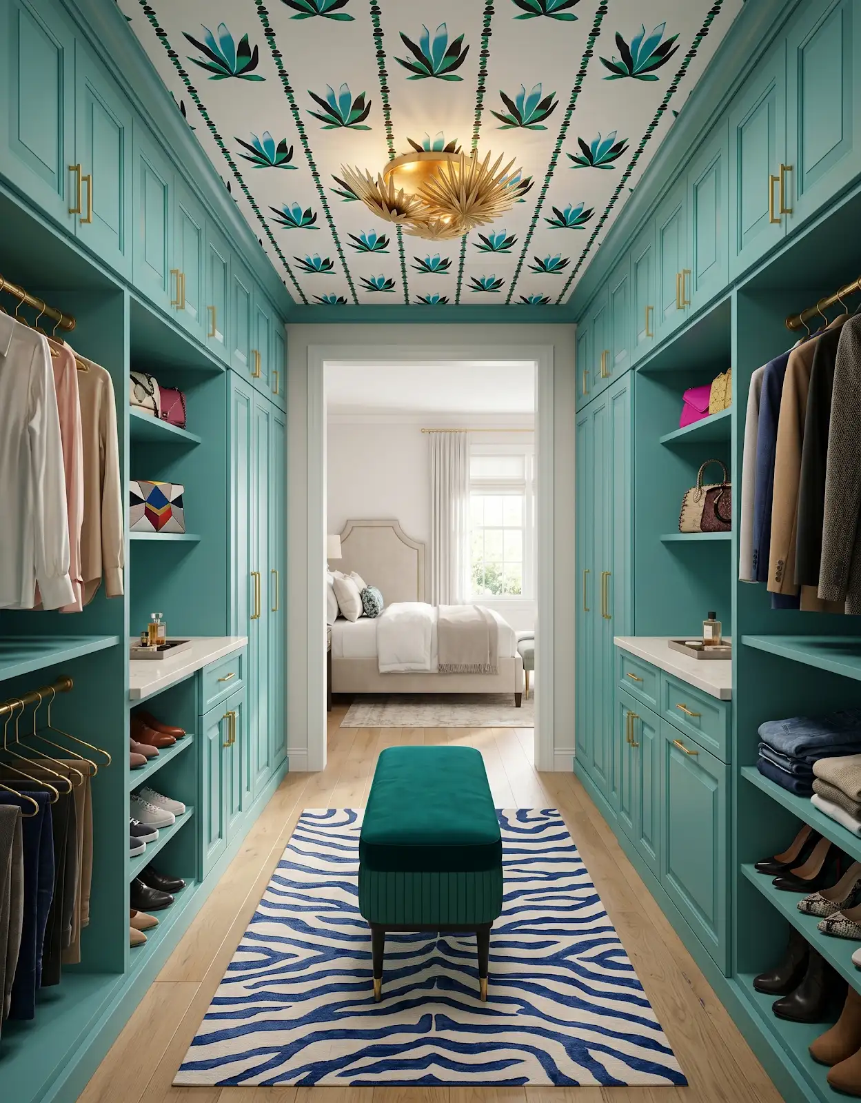
AI-generated design concepts from Anna’s approved inspiration library. Images illustrate color, proportion and finish relationships; they are not completed customer projects or exact manufacturer products.
1. Decide whether the ceiling should disappear
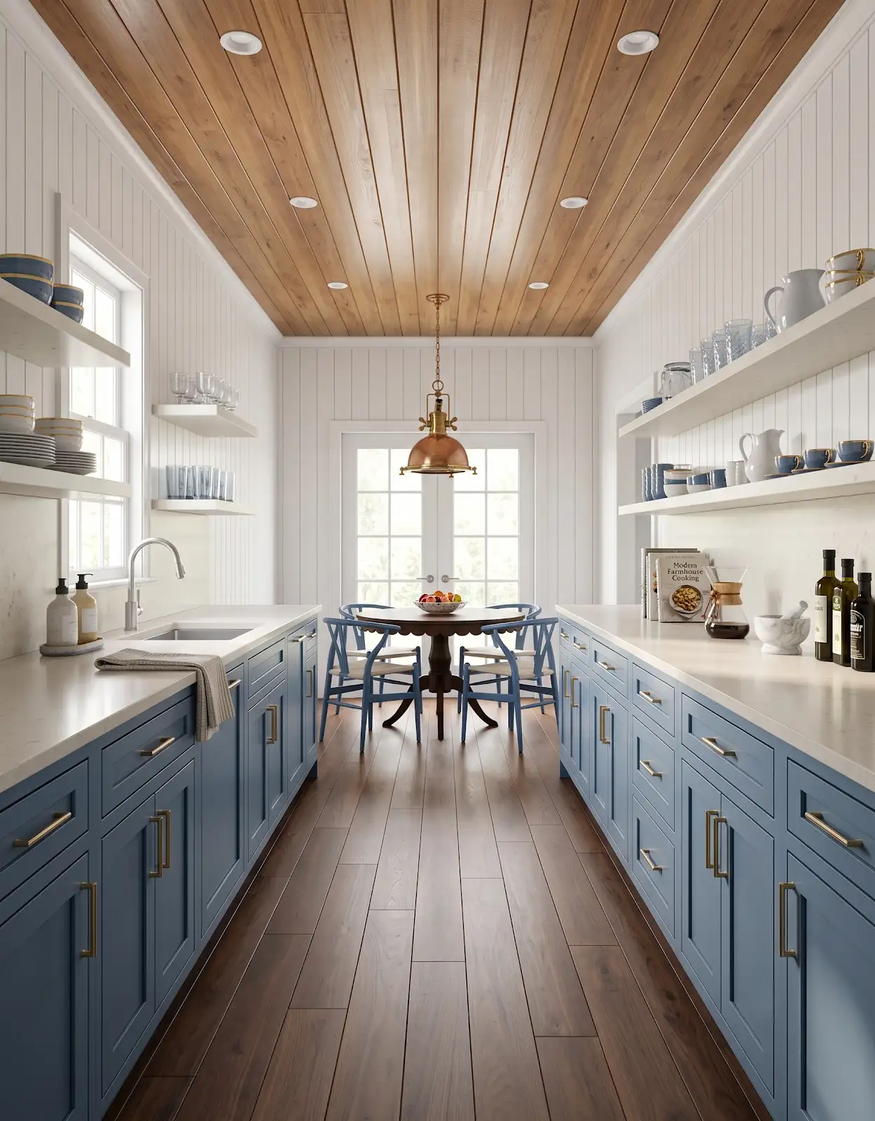
Matching walls and ceiling can soften the boundary between them. Consider whether you want an enveloping room or a clearly defined ceiling plane. Try the idea in the room's actual light before deciding that one approach will automatically make it feel larger.
2. Compare a pale matching palette
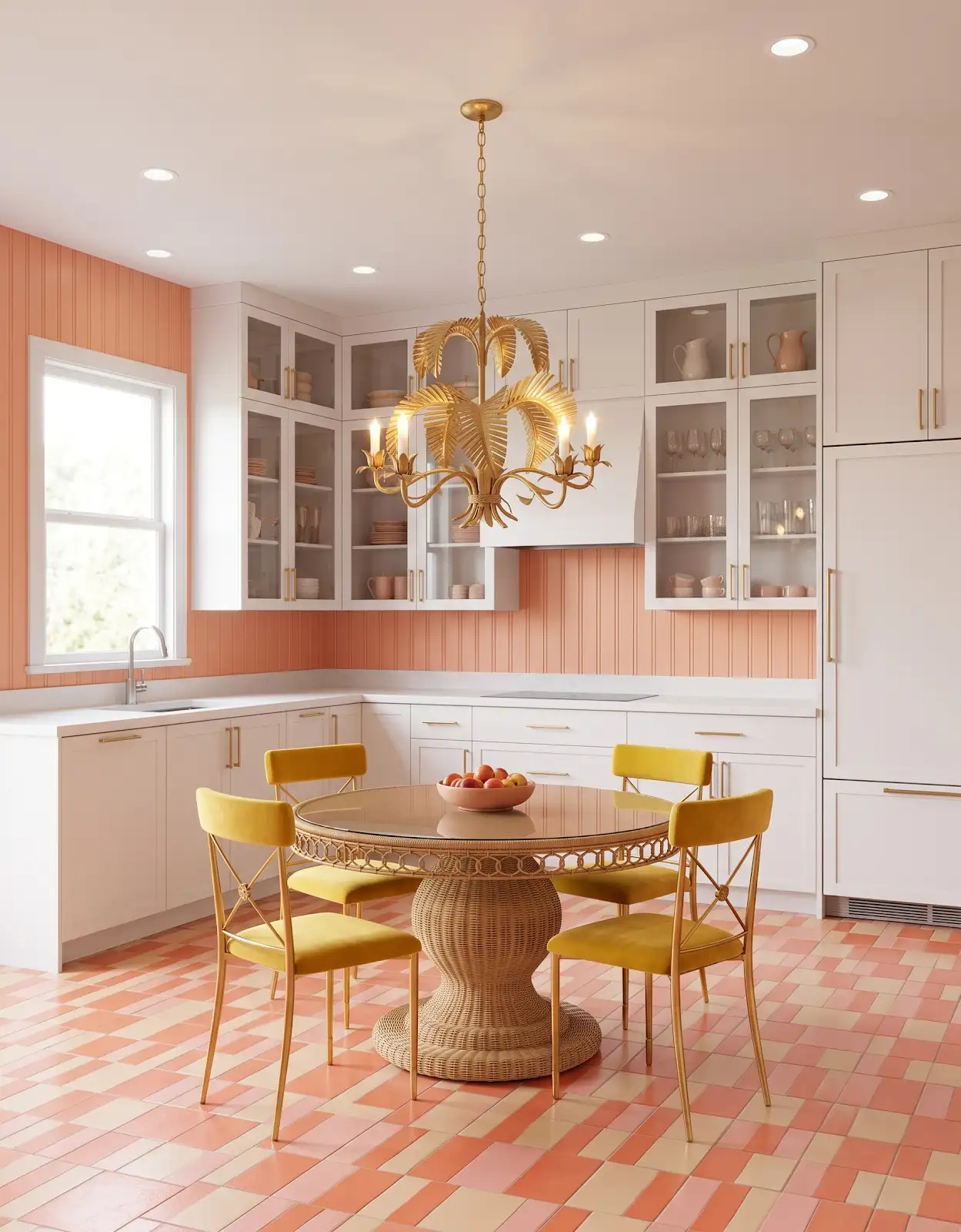
A pale color across both surfaces can create a gentle background for cabinetry and furniture. Include the trim in the comparison. Even a subtle difference between wall, ceiling and casing becomes more noticeable when those surfaces are viewed together around a window.
3. Consider a deeper ceiling deliberately
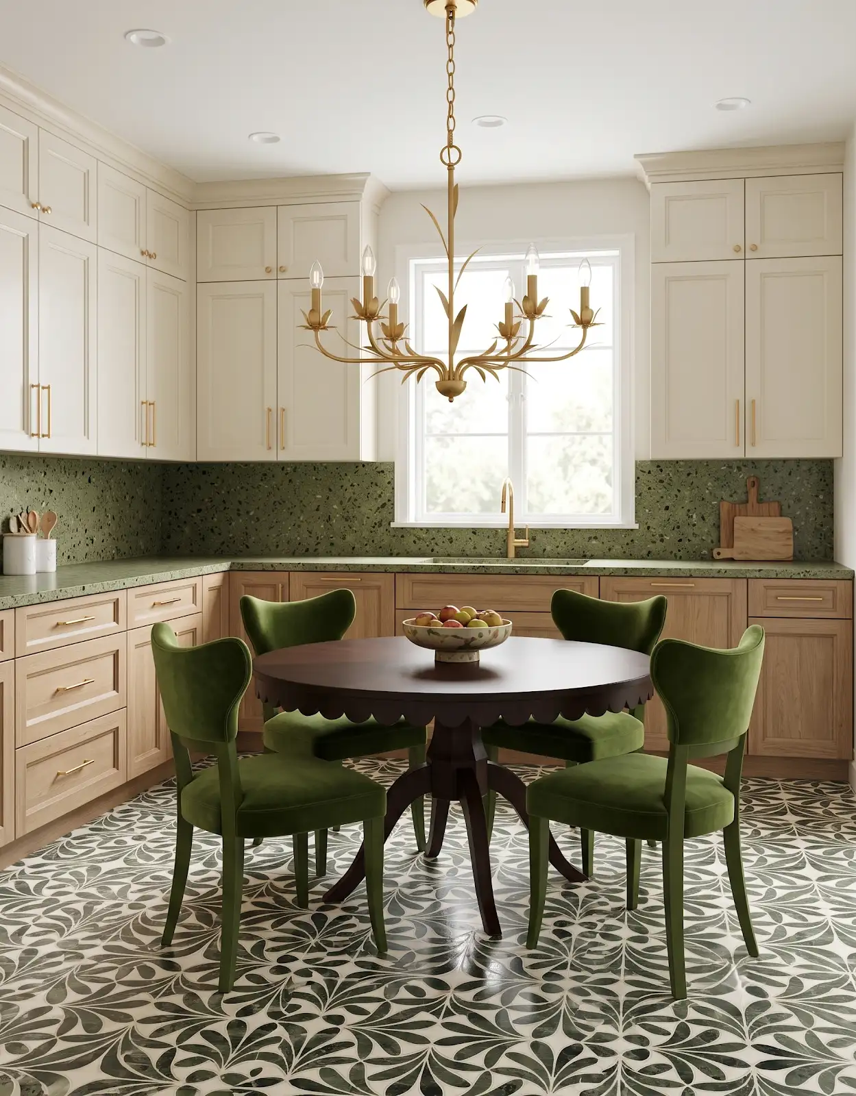
A deeper color can make a room feel intimate, especially when the furnishings support that mood. Look at the room after sunset as well as during the day. Decide whether the effect feels comfortable for the activities that happen there.
4. Keep white as an intentional option
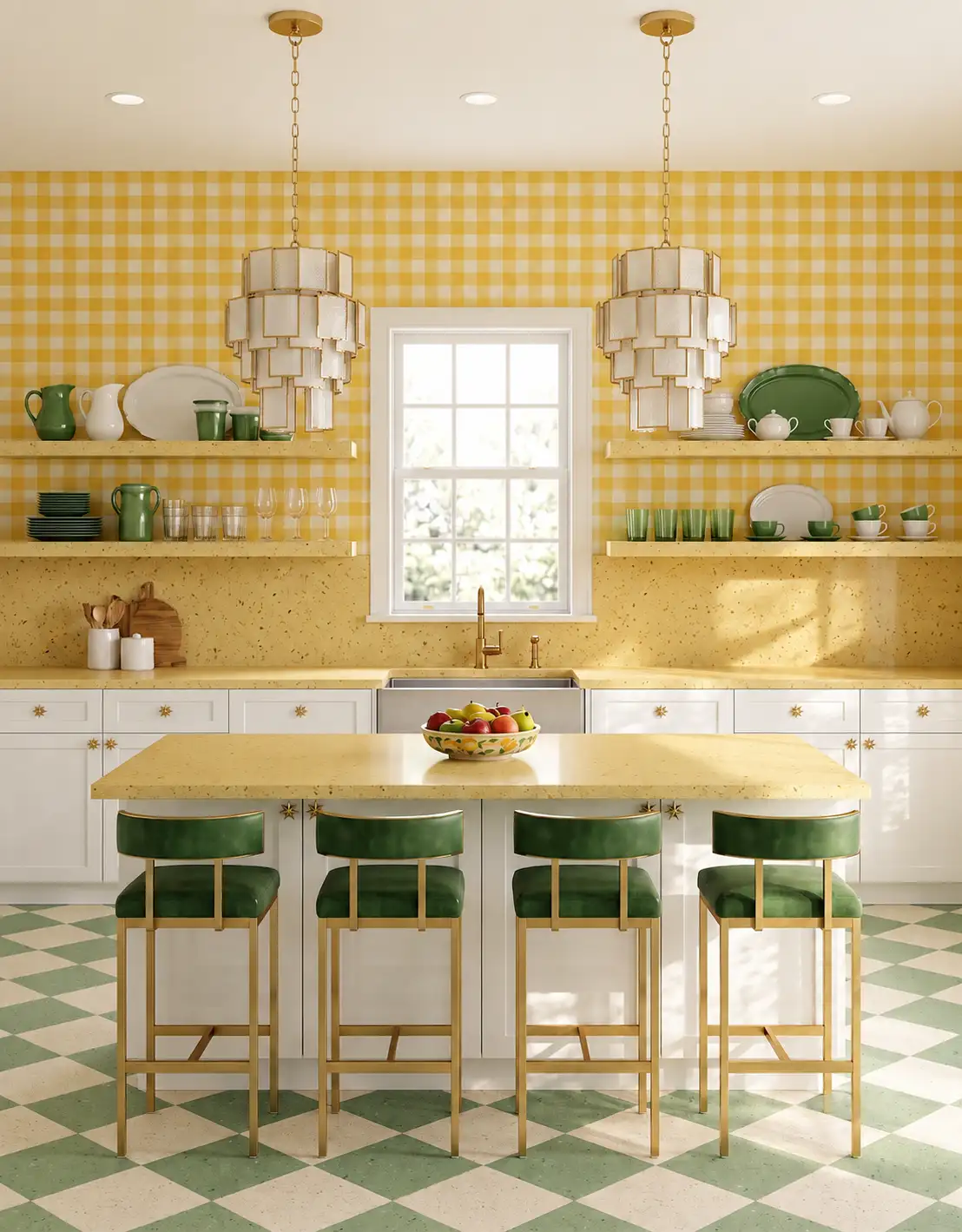
A white ceiling creates a visible relationship with colored walls. Compare its undertone with the cabinetry, trim and other pale surfaces. White is not one universal color, so the specific sample matters just as much as the decision to use it.
5. Include sloped ceilings and beams
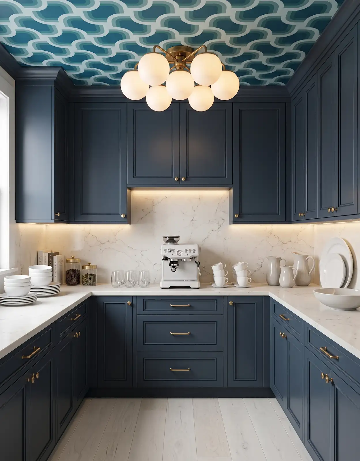
Photograph unusual ceiling lines from several viewpoints. Decide which shapes you want to emphasize and which you would prefer to blend. Existing beams or a wood ceiling may already provide enough overhead character without adding another strong color boundary.
6. Compare the wood already in the room
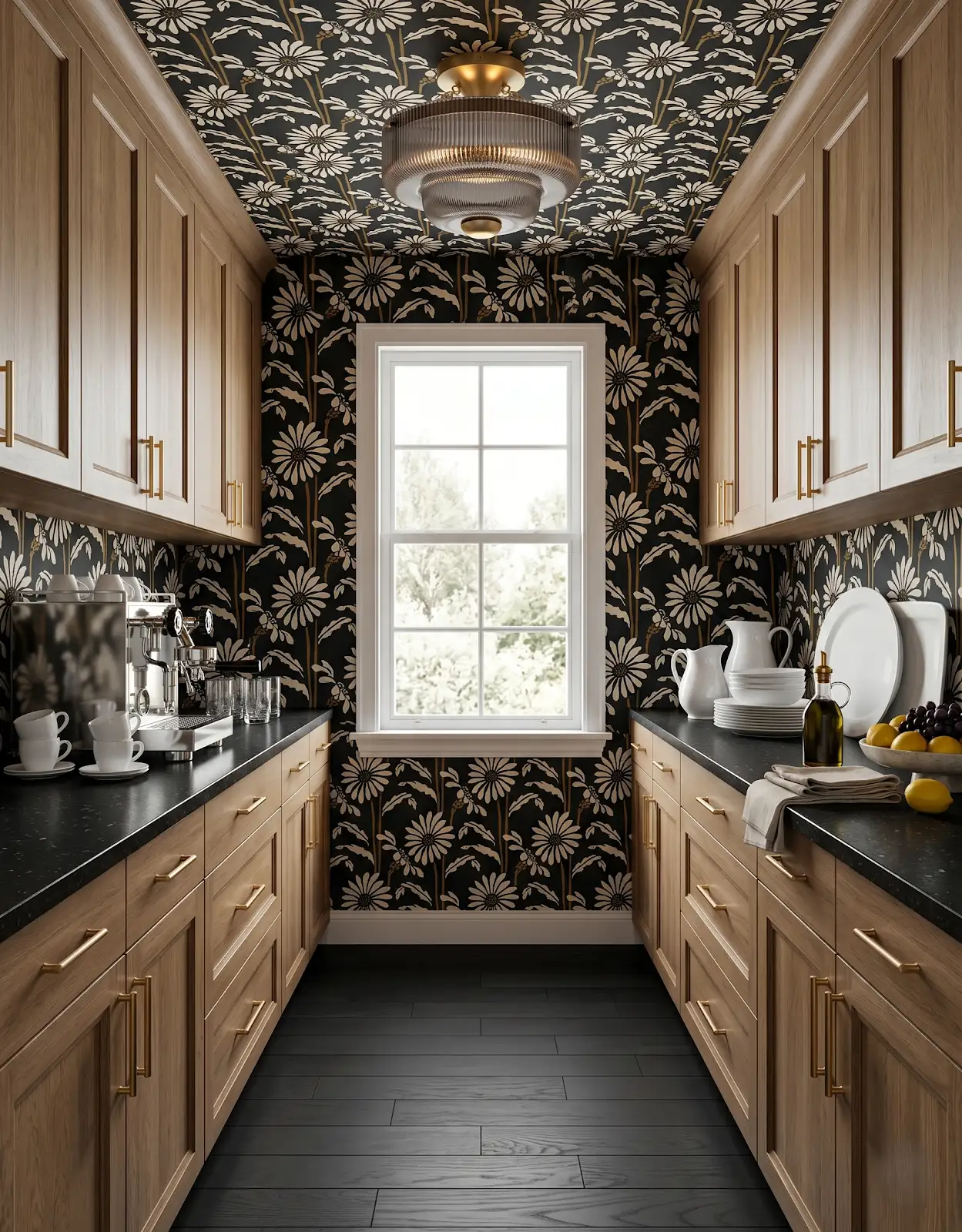
Warm trim, cabinetry and flooring can shift how a ceiling color feels. Bring those finishes into the sample group. A color that looks quiet against a white background may read cooler or more saturated beside an extensive area of wood.
7. Look at the evening lighting
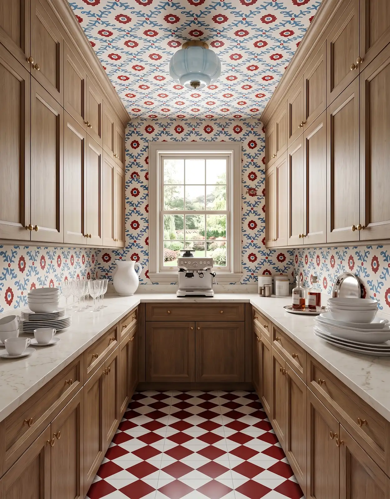
Use the room's normal lamps and overhead lights when reviewing samples. Light direction changes which surfaces are prominent. If the room is mostly used in the evening, a daylight-only decision may miss the version of the palette you will see most often.
8. Make a representative sample
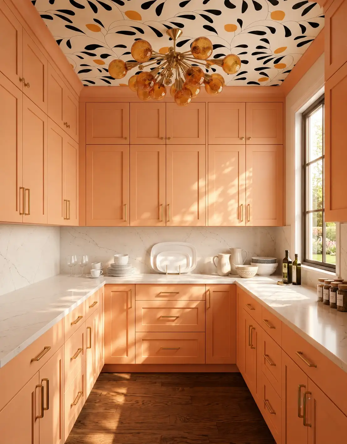
Compare larger samples of the proposed wall and ceiling colors in their intended orientations. Discuss finish and application with the painting professional or supplier. A concept image is useful for mood, while the actual products and room establish the final effect.
9. Coordinate the surrounding finishes
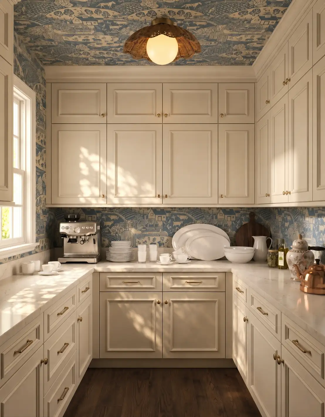
Bring the ceiling direction alongside cabinet, floor and countertop choices to The Design Center. We can help compare the material palette around the color idea. Keep the paint specification and painting scope with the appropriate supplier or tradesperson rather than inferring them from inspiration imagery.
Compare the options with The Design Center
Browse the relevant guides and official catalogs, then bring your room photos and exact product details to the showroom. We can help coordinate selections and confirm availability, pricing and timing for your project.
Products for Your Home Kitchen & Bathroom Cabinets Flooring in Orofino, Idaho Explore Honest Cabinets All design ideasTHE DESIGN CENTER / OROFINO, IDAHO
Come in with an idea. Leave with a direction.
A favorite color. A cabinet sample. A room that needs a little love. Bring it to the showroom and let’s find the finishes that feel like you.
Step inside the showroomFind us on Johnson Ave.
124 Johnson Ave, Orofino, ID 83544
Monday–Friday · 8am–5pm
Call or text 208-786-0361
Directions & contact details