
Warm Neutral Rooms With Texture and Depth
A neutral palette can feel rich without relying on strong color. The interest comes from differences in tone, grain, texture and sheen. Choose a clear background, then compare how cabinetry, flooring and surfaces add enough contrast to keep the room from feeling flat.
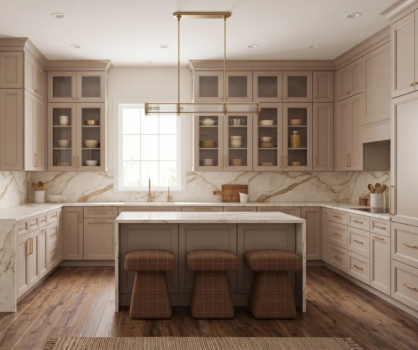
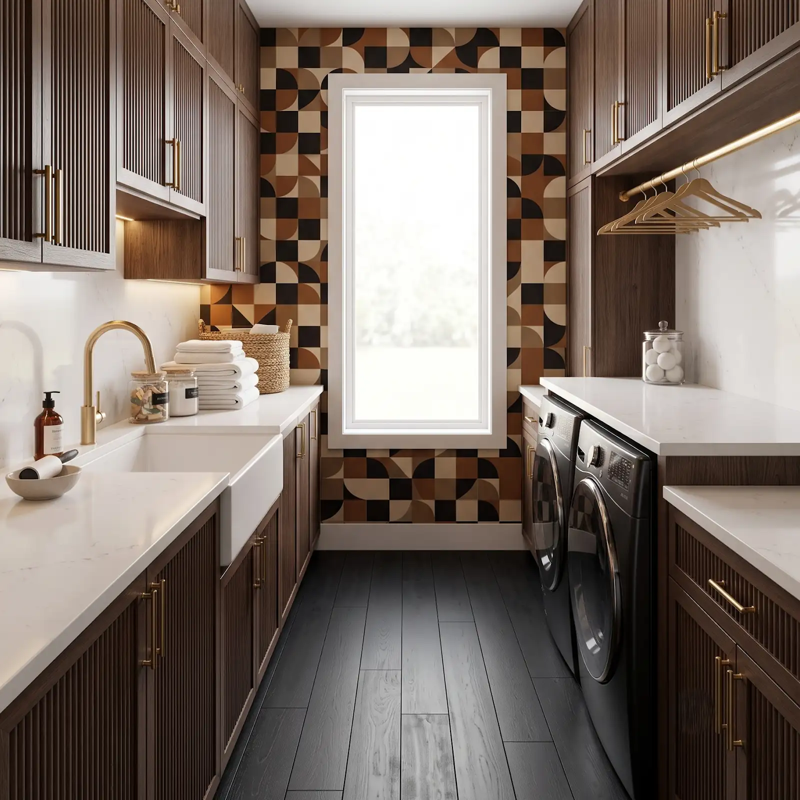
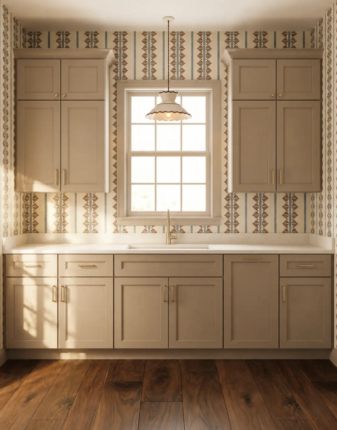
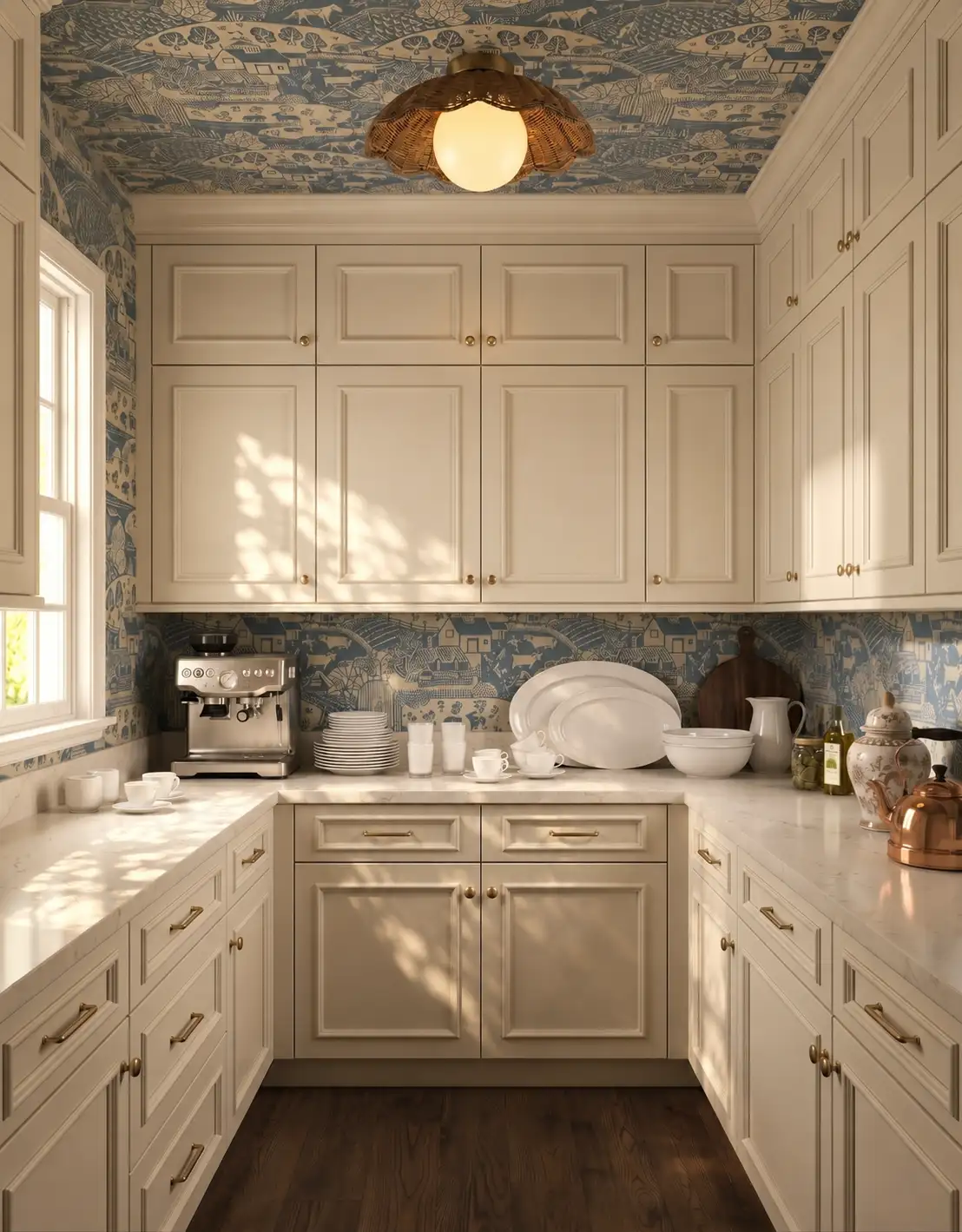
AI-generated design concepts from Anna’s approved inspiration library and additional images created for this website. Images illustrate color, proportion and finish relationships; they are not completed customer projects or exact manufacturer products.
1. Choose the background tone
Compare cream, beige and warm gray samples together instead of treating them as interchangeable neutrals. Notice which one connects with existing wood or stone. That starting tone will influence whether later materials feel balanced or unexpectedly pink, yellow or cool beside it.
2. Introduce a visible wood grain
Wood cabinetry or a wood-look floor can add movement to quiet colors. Decide how much variation you want to see. A restrained grain creates a different mood from a highly varied pattern, even if both samples are similar in overall depth.
3. Vary light and dark deliberately
A palette made entirely of nearly identical midtones can lose definition. Try a lighter counter against a deeper cabinet or a darker small accent against pale surfaces. The contrast can be modest while still making the individual materials easier to read.
4. Compare texture at the right distance
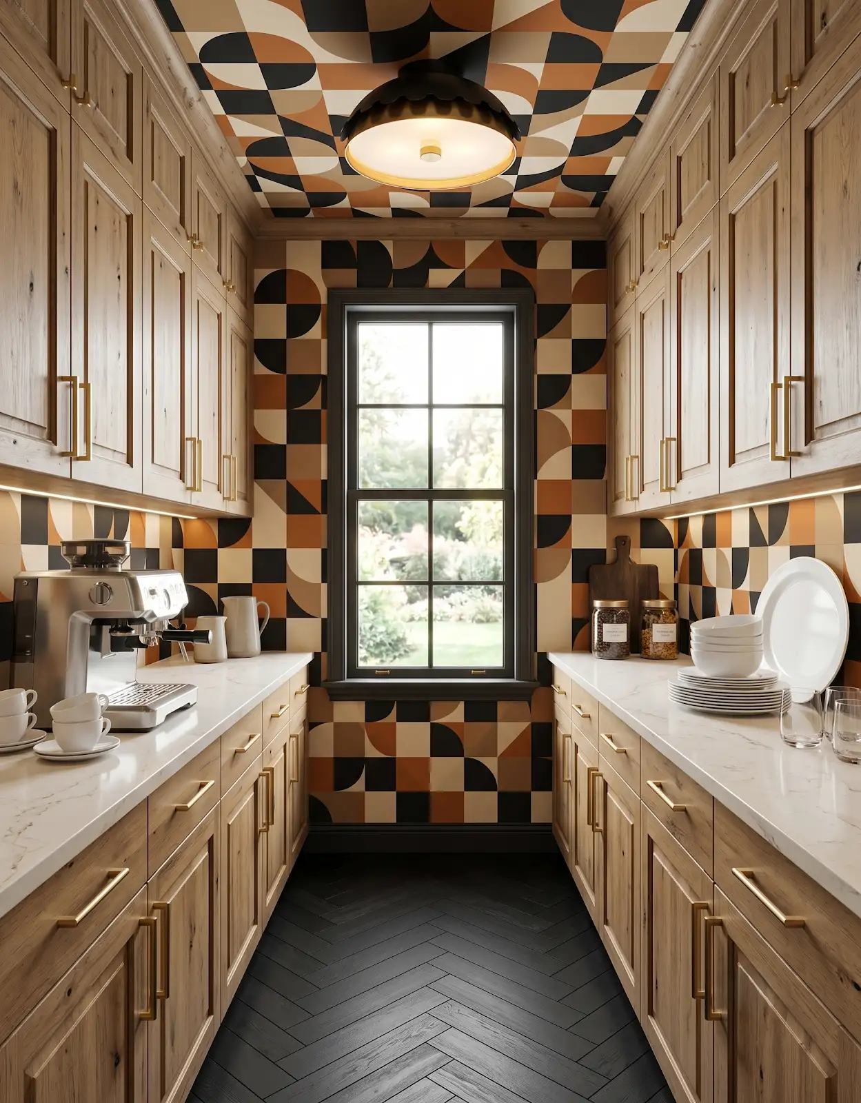
Look at the materials close up and then from the doorway. Subtle texture may disappear at room scale, while strong grain becomes more prominent when repeated. Use larger samples or representative imagery to judge whether the intended interest will remain visible.
5. Include the metal finish
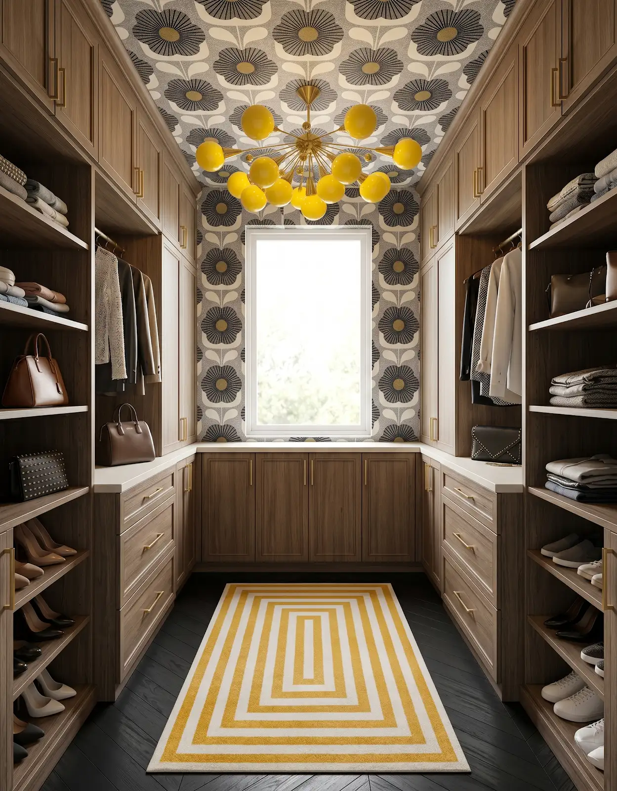
Hardware can supply a quiet warm note or a more distinct dark outline. Hold the sample against the cabinet door and consider nearby fixtures. A neutral room gives these smaller details more visibility, so compare the shape and finish together.
6. Be selective with surface pattern
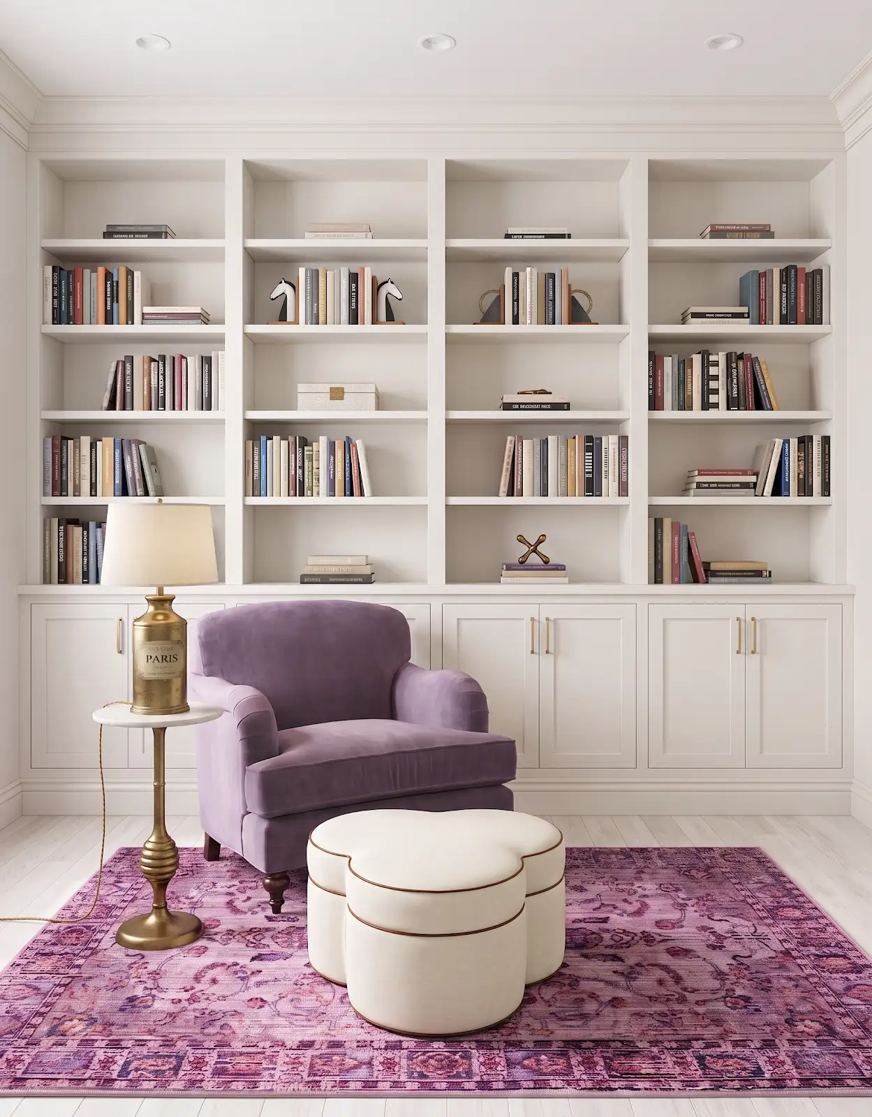
A veined countertop or patterned tile can be the main feature in a neutral room. Compare it with the flooring grain rather than assuming shared beige tones guarantee harmony. You may prefer one expressive surface supported by calmer surrounding materials.
7. View the palette after sunset
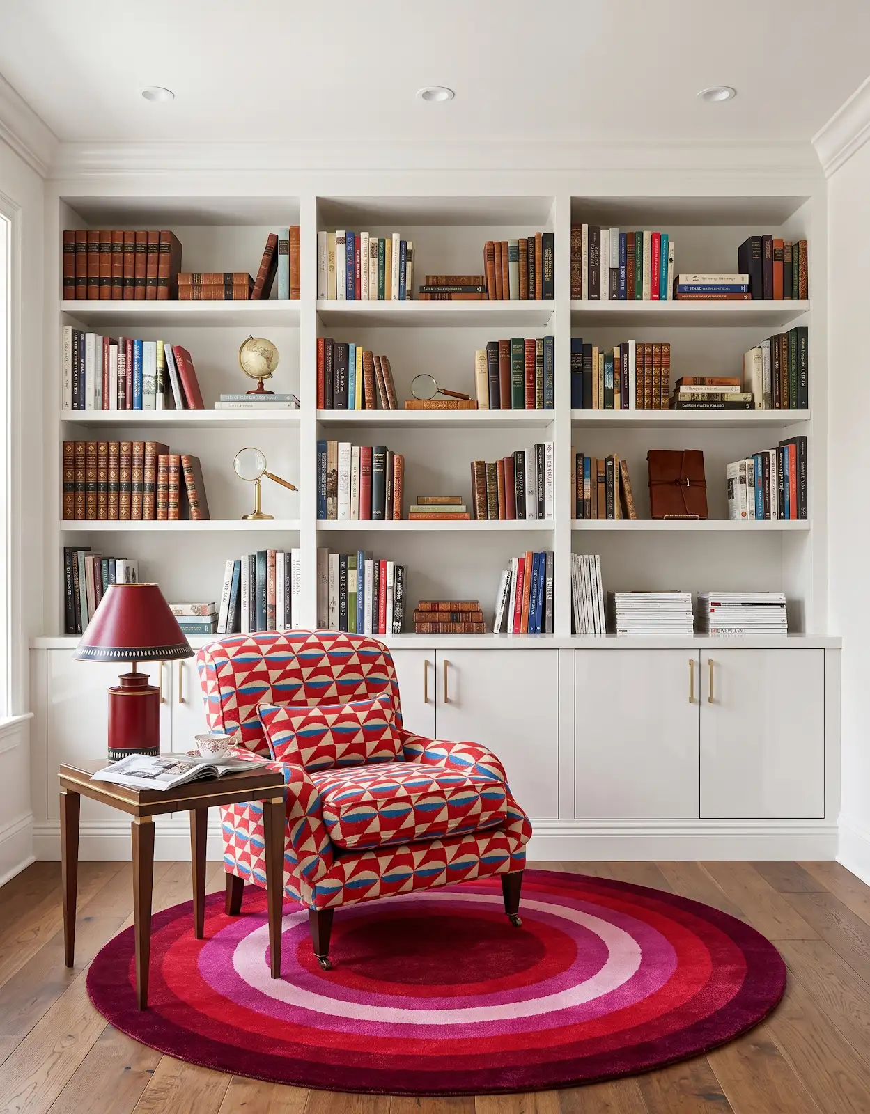
Warm neutrals can shift noticeably under different lighting. Bring the samples into the actual room when possible and compare them together. Photographing them can help record the arrangement, but the physical samples are the better reference for the final color decision.
8. Add textiles to the comparison
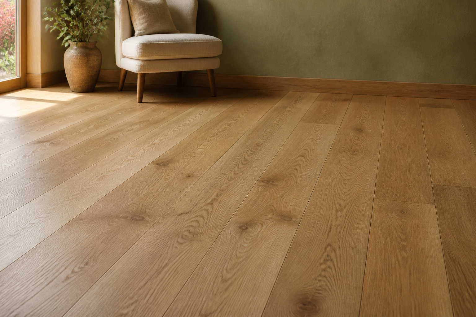
Include a rug or upholstery reference if large furniture will stay. Those soft surfaces occupy significant visual space even though they are not part of a cabinet order. A complete palette accounts for the room as it will be furnished and used.
9. Save a concise material set
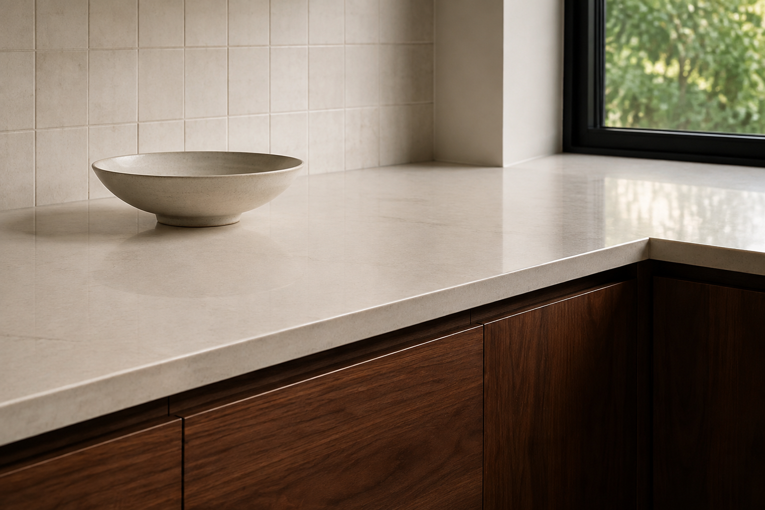
Bring the preferred door, flooring, counter and hardware directions to The Design Center. We can help compare the relationships and narrow supplier options. Keep the exact product identifiers with the samples so the selected neutral does not become a vague color description.
Compare the options with The Design Center
Browse the relevant guides and official catalogs, then bring your room photos and exact product details to the showroom. We can help coordinate selections and confirm availability, pricing and timing for your project.
Products for Your Home Kitchen & Bathroom Cabinets Flooring in Orofino, Idaho Explore Honest Cabinets All design ideasTHE DESIGN CENTER / OROFINO, IDAHO
Come in with an idea. Leave with a direction.
A favorite color. A cabinet sample. A room that needs a little love. Bring it to the showroom and let’s find the finishes that feel like you.
Step inside the showroomFind us on Johnson Ave.
124 Johnson Ave, Orofino, ID 83544
Monday–Friday · 8am–5pm
Call or text 208-786-0361
Directions & contact details